Paving your own path into the world of digital accessibility

Listen to Neovation’s Demystifying eLearning podcast generated with NotebookLM!
Listen to our podcast on your favorite platform!
Let me start with my personal journey to understanding the importance of digital accessibility.
I always think of 2010 as a banner year. One of my best friends had her first child. World of Warcraft: Cataclysm came out, and I was obsessed. Inception was released in theatres and turned everything on its head, pretty much literally. Oh yeah, and I was diagnosed with fibromyalgia (fibro) after over ten years of unexplained pain, fatigue, and brain fog.
If you’ve never had an unexplained health issue, I can’t emphasize enough how relieving it is to finally be able to put a name to what's been happening to you. But knowing the name was only the first step, so I turned to the World Wide Web for more information. And that’s how I first began to deeply understand accessibility beyond seeing curb cuts and disabled parking spots out in the physical world.
My path to digital accessibility discovery
My educational background is as a computer developer, I was actively working a development job at the time, and I had never heard of how accessibility affects the online world before. It wasn't taught in school, and it wasn’t mentioned as a requirement in the work I was doing at the time, nothing. But it was clearly crucial to all these people who were lacking access in one way or another. And none of my coworkers or boss really seemed to care when I attempted to broach the topic.
I kept digging and found more and more information about different types of disability and what I could do as a developer to improve their access, even in the smallest of ways. And that’s what I did. I didn't ask permission, and at first, I didn’t even really talk about what I was doing. When I started at Neovation, though, I did bring it up. I explained why alt text was so necessary and that it should just be a standard part of our development process. I talked about keyboard navigation and how it was a power user feature that I used all the time, in addition to being necessary for people who can't use a mouse. I continued to read and research everything I could get my hands on about disability and accessibility, and I brought more and more of that information back to my teammates and the company as a whole.
A shift in our organizational approach to accessibility
Neovation started to integrate accessibility into the core of who we are. When someone had a terrible (not work-related) accident, we provided a split keyboard and vertical mouse to ease their typing along with other accommodations. When we renovated our office, great attention was paid to the accessibility of the new layout for the sake of an employee who is a wheelchair user, as well as for guests and future employees. Neovation is located in Winnipeg, MB, Canada, and gets a capital W winter every year, and this means shoveling. Lots and lots (and lots and lots) of shoveling. One team member made it a point of pride to always clear our walk down to the pavement, so it was safe and accessible for all of us.
All of this brings us to why you're here today. What do you think of when you read the words “digital accessibility”? Maybe you think about people who don't have access to devices or Internet services that are so essential to our everyday lives now. Or maybe you think of physical accessibility and how that might affect digital offerings and services, such as websites, applications, games, and online learning. In this case, we are focusing on the latter: the ability of disabled people to access the Internet and all its associated wonders. In particular, how can online training be made accessible, and what do we, as digital and instructional designers, training managers, and other L&D professionals, need to know and do to facilitate accessibility in our tools and content?
So, what are digital accessibility standards exactly?
We can start with digital accessibility standards, which have been around for almost as long as the Internet. These standards are overseen by the World Wide Web Consortium (W3C), in particular by a subgroup called the Web Accessibility Initiative (WAI). The WAI developed two primary standards that apply to online learning: ATAG 2.0 and WCAG 2.1.
Authoring Tool Accessibility Guidelines (ATAG)
The Authoring Tool Accessibility Guidelines (ATAG), version 2.0, applies when tools are provided to create content, i.e., developing an online course within an LMS or a 3rd party tool such as Articulate. These guidelines are used by the creators of these tools to ensure that the tools themselves are accessible and that accessible content can be created quickly and easily.
As a content creator, ATAG should be essentially invisible to you, but you should be aware of these guidelines when selecting content creation tools. If accessible content is important to you (as it should be), then you don’t want to be fighting your authoring tool to create digital learning content that’s accessible to everyone.
Web Content Accessibility Guidelines (WCAG)
The second standard is the Web Content Accessibility Guidelines (WCAG), version 2.1. While ATAG handles authoring or creating content, WCAG is focused on users’ ability to access content (particularly disabled users).
WCAG focuses on the end-user, but the guidelines are directed at the creator, whether a web developer, designer, or content creator such as yourself. For instance, the first guideline is to “provide text alternatives for any non-text content so that it can be changed into other forms people need, such as large print, Braille, speech, symbols or simpler language.” From that guideline, as a user, I would expect to be able to consume content in my preferred format, and as a creator, I understand that I need to facilitate this ability by providing captions, alt text, and/or transcripts where needed.
Taking a closer look: WCAG overview
WCAG has three levels of compliance: single A (A), double A (AA), and triple A (AAA). It may seem like a good idea to start with level A criteria if you’re new to digital accessibility, but the standard target is AA, including in countries and regions where WCAG has been explicitly written into legislation. Level A criteria are the barest of bare minimums, whereas AA criteria mark significant thresholds for accessibility.
The guiding principles of WCAG: introducing POUR
The WCAG documentation can be detailed, dense, and hard to understand fully, which is why the guidelines are generally broken up into four guiding principles: Perceivable, Operable, Understandable, and Robust, generally abbreviated as POUR. If you remember nothing else about digital accessibility, remember POUR, and you'll be off to a good start.
Perceivable
This is the first of the four guiding principles for a reason: how can you operate or understand something you can’t perceive?
As humans, our brains receive information from one or more of our five senses, typically via seeing, hearing, or touch. However, if a user is blind or has low vision, they may need to use one or more additional senses (such as hearing) to access information instead. A common tool is a screen reader: technology that reads out the content of a website or application to the user instead of (or in addition to) them taking it in visually.
Screen readers
Did you know that the most common categories for disability are pain, flexibility, mobility, mental health, dexterity, hearing, and finally, seeing, learning and memory? There is a tendency to focus on blind users and screen readers when discussing digital accessibility, putting accommodations for other disabilities to the side. Screen readers are essential tools in this modern, connected world, but they are not the most common type of assistive technology used by disabled people and shouldn’t automatically be prioritized above other accessibility issues.
If you’re unfamiliar with screen readers, take a closer look at your phone – both Apple and Android devices have screen readers built in (VoiceOver and TalkBack, respectively), and they’re relatively easy to use. Dive into the accessibility settings on your device and access a website or application you use daily. What’s the same and what’s different about receiving information this way? Can you access and navigate familiar sites with ease, with difficulty, or not at all?
Semantic markup
In general, on the web, using what is known as semantic markup is key to accessible websites and apps. If you’ve tried out a screen reader recently, you may have noticed that these tools (and others like them) present a lot more of the underlying structure of a website than a non-screen reader user might expect.
For instance, while an abled user can see if a link has been visited based on the color (assuming the link has been coded properly), a disabled user with a screen reader or other assistive technology will instead rely on their device to expose or announce the fact that the link has been previously visited.
Consider your low-vision or blind users
Images can be tricky for low-vision or blind users, as well as those with slower or low bandwidth connections, which is why the concept of alternative or “alt” text exists. This is the text that explains or describes the image for those who cannot clearly see it and/or those who cannot load it. This type of dual advantage as a result of accessibility efforts is known as the curb-cut effect. Those little dips in the sidewalk at corners were originally meant to ease the path of wheelchair users, but they also benefit people with other mobility issues, people pushing strollers, or even someone walking with their luggage. Many accessibility features provide benefits to non-disabled users in addition to disabled ones.
Depending on the tool you’re using to create content, there are usually standard elements, such as titles or headings, buttons, and links, available to you. The key to accessing content is to use these elements that have been provided rather than creating your own, similar-but-different version. While I’m sure you have nothing but the best of intentions in creating a new, slightly different type of button, you’re also typically losing out on work that has been done to make the element accessible, including additional semantic meaning that exists in the background and is unlikely to be recreated in your custom version.
Color
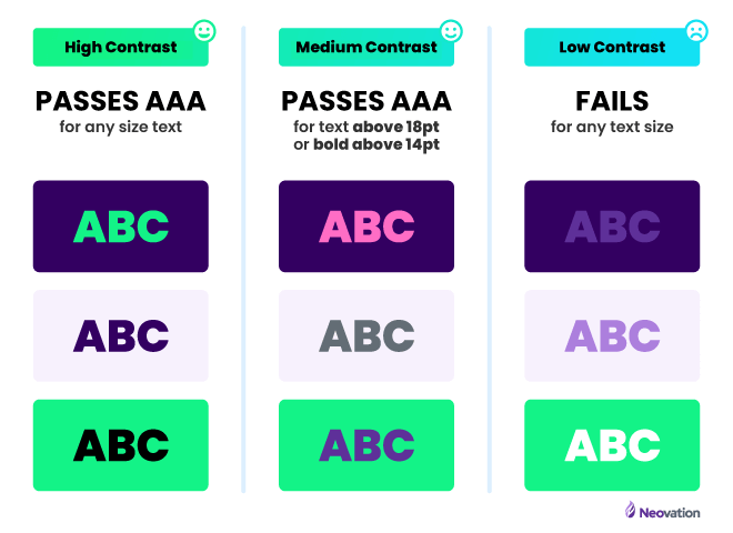
Color is a key aspect of the perceivable guideline. Around 14% of the population worldwide has some type of color blindness or low vision, both of which can cause problems when colors (i.e., the background of a button and the text on that button) do not have sufficient contrast. The specific WCAG guideline is to aim for background and text contrast of 4.5:1 at the AA level and 7:1 at AAA.
Accessibility tools can help you when calculating your color contrast
It sounds a bit like a high school calculus problem, doesn’t it? Take color A and color B and derive number Z! Luckily, it’s not that complicated due to tools that handle the math for us, such as Contrast Ratio by Lea Verou. Before you use corporate blue for headers in your content, check the contrast against your background color (generally white or black in dark mode). If it’s lower than 4.5:1, you should consider using a different shade or hue of the selected color or a different color entirely.
Another color consideration is using color alone to convey meaning. Imagine a grade written in green (i.e. a pass) and a second grade written in red (a fail). While it may be clear to you that the selected colors clearly indicate the passing status of the course or learner, someone who is red-green color blind may not be able to distinguish between the two colors, thus losing the context you’re attempting to provide. One possible solution is to add an icon to the grade (while keeping the colors), such as a thumbs-up and thumbs-down. Icons can add extra complexity, though, for users with cognitive disabilities and those from different cultural backgrounds who may not have the same context as the person who selected the icon.
Transformable
The final aspect of perceivable is content being transformable to support users with different needs and abilities. In practice, this means providing text alternatives for images, video, and audio content.
Transformable images
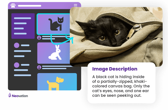
Providing alternative or alt text for an image is as simple as describing the image in a way that provides the same meaning and context a visual user would receive. Writing alt text is simple, but writing good alt text is a skill of its own and requires thought and practice.
Fun fact: all major social media platforms have the ability to add alt text to images when posted. It’s not necessarily enabled by default (a failure to meet ATAG criteria), but look at the accessibility settings on Instagram, LinkedIn, Twitter, and Facebook. Accessibility isn't just a consideration at work, and we can (and should) put effort into it in our personal lives as well.
Transformable audio
A transcript is required if you’re providing purely audio content (no video component). And again, transcripts don’t just benefit your disabled users either. Have you tried searching through a podcast for that section you want to share? It’s not very easy, but a text transcript with timestamps, on the other hand…
Transformable video
For videos, you have a few options for transforming the content. Captions capture and display the speech in the video, like subtitles on a movie or TV show. Another option is described audio, which is a narration of everything appearing on the screen. If you’ve never seen or heard audio descriptions, think of them like telling a story to a friend: “I went to that new restaurant yesterday, and it was gorgeous inside! Tall ceilings with decorative moldings at the top done in rich, dark brown wood. The tablecloths were a snowy white, and the silverware gleamed in the light from the fancy light fixtures”.
Operable
Have you ever been working with a wireless mouse and had it die out of nowhere? And then you’re looking around for batteries and can’t seem to find any, and resign yourself to trying to use the tiny trackpad on your laptop. What if you knew that a key element of operational accessibility is the ability to navigate a website or an app with only a keyboard (or keyboard-equivalent device)?
Some disabilities limit the range of motion or increase the difficulty of skills that take fine motor control, such as clicking or tapping on buttons. Operability as a principle generally refers to keyboard accessibility, as most assistive devices mimic keyboard functionality.
Tips for evaluating operable support with your selected LMS
When evaluating a learning management system or content for accessibility, disconnect your mouse and attempt to navigate. Some points to consider:
- Is it possible at all? Some sites, apps, or content may have missed operable so thoroughly that it simply cannot be navigated if a mouse isn't being used. This isn’t a failure of the user, it’s a failure of the developer, designer, quality assurance, and, frankly, management for that site or app.
- If you can navigate, is it always clear where you are on a page or within the content? For elements that the user can interact with, like buttons, this would be indicated by a focus state, a clear and distinct outline showing that it is the active element.
- Can you interact with all the controls or elements on the page? This includes buttons, as above, but also menus, links, form fields, pop-ups, and dropdowns.
- Is the content structured in a meaningful way? Do headings progress in order and correctly introduce a section/subsection? If there's a form, are the fields appropriately and accessibly labeled?
- Can irrelevant or repetitive sections, such as menus, be skipped or bypassed quickly and easily?
- Was it easy to understand how to navigate this way, or was there a lot of trial and error? Imagine this being your first experience as a newly-disabled user. Would you be encouraged to continue or discouraged and never want to return?
Speaking of errors, being able to recover from an error is another key piece of operable. Users will inevitably make mistakes, and if they select the incorrect answer in a quiz, it might not be an error you allow them to recover from, but accidentally deactivating a user in your LMS should definitely be something correctable.
Ensuring that there are confirmation alerts or warnings before performing key actions benefit all users, not just those who are disabled. If there's a long and/or complex process coming up, provide instructions before a user starts, which can help avoid errors before they happen.
Understandable
Perceivable and operable content, check. Now, can your users understand what they’re being shown, told, and asked to do? Especially for content authors, language matters. The words you choose to use matter. Knowing your audience – their education, background knowledge, life experience, and culture – can all affect understanding, especially if you’re using specialized terms or acronyms. As a general rule, use simple and concise text whenever possible. Introduce the full term before using an acronym, clarify the context for a common term that’s used slightly differently in your industry, and keep in mind that the average reading level in wealthy, white, Western countries such as the United States is roughly equivalent to the 8th grade (a 12-year-old).
Understandable functionality
The functionality must also be understandable for admins and learners of your LMS. Ad-hoc standards have been adopted across many websites and apps, such as the “hamburger” icon that represents a menu. This icon of three equally spaced horizontal lines is what users are familiar with looking for and selecting when they're trying to navigate the site or find a directory. Deviating from this norm can cause confusion and stress for your users, disabled or not.
Forms can be particularly complex to understand. Sometimes the Next or Submit button on a form will be disabled until certain fields are filled out, but it’s not always clear what exactly to do to enable the button. This leads to a terrible experience for all users and should be avoided. Instead of disabling the button, consider an alert or notification that the required information is missing when the button is clicked instead.
Robust
The final principle is robust, which boils down to the fact that websites and apps should just work, regardless of the user’s chosen technology. Maybe they’re on the latest and greatest cellphone, or maybe they’re using one from 10 years ago. Maybe they’re using assistive technology of some kind, or multiple kinds, or not at all. It is essential for users to be able to choose their own technologies in order to meet their own unique needs. Of course, a company or organization can enforce restrictions for safety and security, but they shouldn’t be overly restrictive, and users should be consulted before deciding that only the latest version of Chrome can be used to launch learning content.
For websites and apps in particular, a great deal of effort goes into codifying standards that allow older sites and apps to continue to work and also provide future proofing for new technologies and devices. For example, when the Apple Watch was first announced and shown to be able to view websites, the company assured developers that if their site was following HTML standards, they could expect it to work immediately, with no need for changes or additions.
What next steps should you take with digital accessibility?
Unfortunately, and fortunately, we are still in a period of consciousness-raising when it comes to digital accessibility. It is unfortunate that while accessibility has been considered from the beginning of the web nearly 30 years ago, it still seems to be a topic that not many people know about and falls by the wayside. On the other hand, bringing the concept of digital accessibility to people who have never heard about it before and want to do better can be encouraging and fulfilling. Be that person: bring the concepts and ideas of digital accessibility to those around you and build your own accessibility toolbox over time.
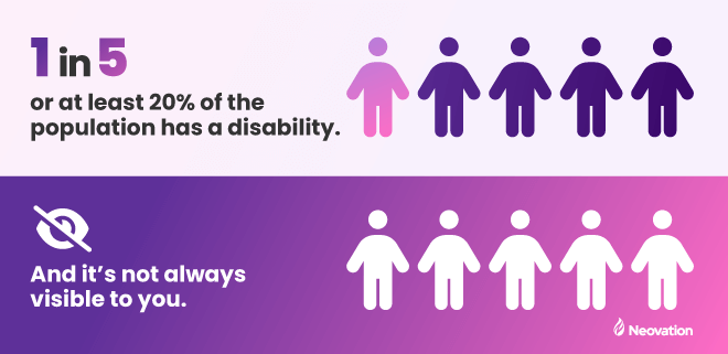
Your employees’ disabilities may be invisible to you
And maybe you’ve been thinking, “we don't have anyone who's disabled in my company/in my audience for that course,” which is completely incorrect. Disabled people exist, we are 20% or more of the population, and invisible disabilities exist, so you really have no idea if someone is disabled or not just by looking at them. I guarantee there is someone in your company or audience who has a disability that will be affected by the way you choose to present and structure your content, and it’s up to you to ensure as many people as possible are able to access it fully and easily.
Remember that considering and implementing accessibility from the beginning of a project is always going to be easier than trying to retrofit it later. Accessibility is a fundamental pillar of the development process, whether we’re talking about software or content development. However, even if you’ve already started on your project, you should consider how to shift the mindset of your team and organization to make accessibility a priority.
Digital accessibility should apply to all areas of your organization
Don’t forget about other internal tools and processes beyond the realm of training. Could a disabled employee be hired at your company tomorrow and use all the required tools as quickly and easily as a non-disabled employee?
That includes physical accessibility
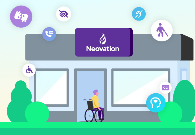
In the same vein, don’t forget about physical accessibility, which, although it’s been around for much longer than the digital version, still isn’t always handled appropriately and causes issues for many disabled people, particularly wheelchair users, and others with mobility concerns. Is your office building or store physically accessible to all employees and visitors? Are you sure about that?
If you’re hosting an event, are there accessible and gender-neutral washrooms available? If food is being served, is there a process for handling allergies and sensitivities? If you’re using a venue for the event, is it truly physically accessible? People with limited mobility often hear something like, “oh, there's just one small step. I’m sure it will be fine”. It is not fine, and that venue is not fully accessible, no matter what they claim. Disabled people know venues and locations that aren’t fully accessible, and thus where they are not welcome, so reach out to your community to see if there’s a better option.
Consider accessibility in all aspects: physical and digital, at work and home, for your employees and customers. Continue to educate yourself on the many facets of digital accessibility – and perhaps, a great place to start is by reading our learning hub articles. If you’re looking for more resources about accessibility, review “Why your company should care about eLearning accessibility, now” and “What is accessible online training?” as your starting point. Together, we can make the world a more accessible, more welcoming place for everyone.
Listen to our podcast on your favorite platform!


-svg.svg)
-svg.svg)
-svg.svg)
-svg.svg)